
It’s well known that we all hate queuing, wasting time, being in some place when we could be doing something else etc. Brits are amongst some of the worst people in the world that this applies to. However, thanks to a new addition to Google searches, all those things might be something of the past, as you will be able to see just how busy a place is.
Take a look at the picture below to see what we are talking about. You may have already seen it on your searches and not realised that it was a new feature perhaps?
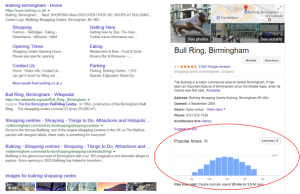
Above: The ‘desktop’ version.
This is actually only half the story, as this feature has been rolled out on Google maps for iOS and suffice to say through checking this out, the feature is even better and more pertinent for mobile devices. When you think about it this makes real sense. You are unlikely to be out on your travels lugging your desktop with you. With a mobile phone, you will be able to check real time information at the touch of a few buttons, that will help you to inform and plan your decision as to whether to visit a place or give it a miss till a quieter time. Now we’ll explore some of the features that make this really handy.
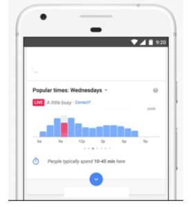
Above: The ‘mobile’ version.
1) The information is live so you can be sure that it is up to date and on hand exactly when you need it. This can be seen easily by the pink live box.
2) Next to the above box there is a little description as to what the volume of ‘traffic’ is like now compared to normal circumstances. As the picture shows, is it a little busy, a little quiet, or as normal? This can be a handy piece of information to know as some places are likely to experience ‘seasonal traffic’ and this will be reflected by this feature. You yourself can also get involved with the data by reporting whether the suggestion is correct or not and submitting how busy you think it is. We assume that Google correlates all responses to this and has some sort of algorithm for updating as appropriate!
3) A handy graph features allows you to explore all times through the day so you really can choose a best time to visit if you have certain requirements. This graph data is also plotted against a ‘peak’ point so you can physically see when the locations busiest time is. The time as at checking is shown by the bar graph being in a different colour to the rest.
4) There is finally a ‘people typically spend’ feature displayed also. You may think this is a bit pointless as how long other people spend at a venue or location is not really any use to you. However, this is a clever thing to be aware of. If you are planning to go somewhere at a certain time then by knowing how long people roughly spend there, you can predict how busy your whole experience is likely to be and whether this informs you to choose another time. Complicated but clever! It is worth mentioning though that this is based on predictable behaviour so it may not always be exactly true.
The conclusion?
This is a very useful and novel design which takes micromanaging to a new level. People are used to being micromanaged at work perhaps, or micromanaging their diaries, but now you can even do this with your trips and visits to different locations. Next time you want to go shopping on a Saturday afternoon, give this a try and see whether it makes your life easier!
While on our site, find out more on social media and how this can help expand your audience and outreach aims.